


Responses by Jason Bradley, creative developer, Jason Bradley Studio, and Rogan Jansen, cofounder and creative director, DashDigital Studio.
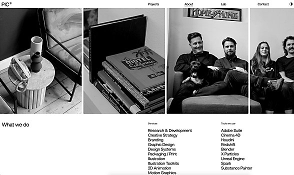
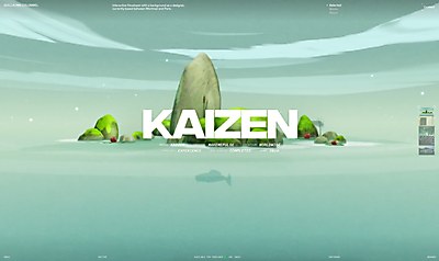
Background: “Studio PIC sought to revamp its digital presence to better align with its creative work while transforming its website into a lead-generation tool for its target audience,” says Rogan Jansen. “The studio required a visually driven website that could showcase its video-intensive portfolio without compromising performance. Minimalist design became a key priority, as this would enable its work to take center stage while ensuring a smooth, intuitive user experience. Instead of relying heavily on traditional navigation, we designed the site to encourage exploration, guiding users organically from project to project to create an engaging, immersive browsing experience.”
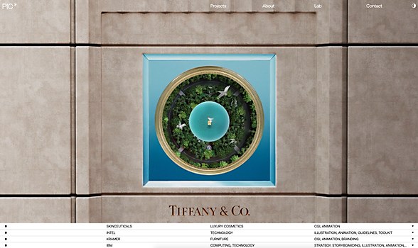
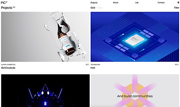
Larger picture: “The main target audience is potential clients and entities in the services and skills of Studio PIC; therefore, the main purpose of the website is to get visitors up to speed with Studio PIC’s talent as quickly and seamlessly as possible,” says Jason Bradley. “With this in mind, well-informed and concise decisions can be made to achieve this. Once the purpose is clear, considerations and decisions tend to sort themselves out as there is a path to success. Studio PIC has been continuously creating excellent work and felt that its online presence should be in line, resulting in a consistent, high-quality body of work across creation and presentation. The website covers the latter by having a sleek, easy-to-digest layout and feel. The above-the-fold section of the homepage and Projects page both have a promotional essence where the reel and projects are immediately visible to promote the body of work right away.”
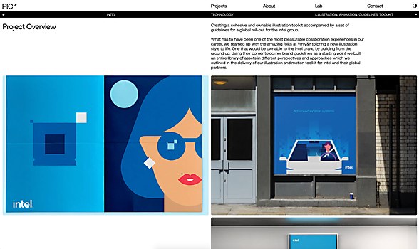
Design core: “The Studio PIC website features a minimalist design that prioritizes seamless user experience, navigation and visual storytelling,” Jansen explains. “Key elements include the video-intensive portfolio, which emphasizes high-quality CGI, animation and illustrations through project showcases for global luxury and tech brands; smooth transitions, as the navigation encourages exploration between projects without relying heavily on traditional menus; highlighted collaborations with well-known brands like Gucci, IBM and Intel, reflecting Studio PIC’s expertise in brand identity and immersive digital experiences; and seamless exploration, as the navigation gives users an exploratory experience rather than a linear journey. What differentiates this site is its ability to showcase complex, video-centric content in a smooth, user-friendly way without sacrificing performance.”
Favorite details: “We believe the site is exceptionally well thought out, with each element serving a clear purpose and executed tactfully without overcomplicating the design aesthetic,” says Jansen. ”We particularly love the main project slider and the seamless transition from the homepage project call to action (CTA) to the project overview. Another standout feature is the smooth transitions between projects, which not only provide informative content but also elevate the overall user experience with their beautifully fluid motion.”
Challenges: “Creating an enticing website while respecting the content and overall performance,” says Bradley. “The website’s content is quite unique as it is video heavy and vastly variant. We needed to find a balance between serving content fast and respecting its complexities in color, resolution and details.”
Alternate paths: “For future reference, we would love to spend more time on exploring and finding new strategies to optimize video-heavy websites,” says Bradley. “With saying that, we mean different load strategies, hosting providers, compression and automatization, among others.”
New lessons: “Video and browser artifacts,” says Bradley. “The way videos load from different resources can play a huge role in performance. Moreover, the best fit can depend on the project requirements. Some motion ideas are feasible to develop, but the different browsers can render them differently in certain edge cases.”
Navigation structure: “The navigation is fairly straightforward,” says Jansen. “The one area we did need to pay closer attention to was the navigation within the grid and how it locked into other areas of the site—the main project slider, for example. The challenge was to ensure the additional section below, which contained project information, integrated smoothly without disrupting the overall layout.”
Technology: “The front-end framework for Studio PIC’s site is Nuxt with a custom Node.js back end,” Bradley explains. “For the majority of the motion, we relied on the GSAP motion library and plugins such as ScrollTrigger. For the page transitions involving media persistence, we used WebGL.”
Special technical features: “To capture the essence of Studio PIC’s bespoke work, the site’s motion was developed to be calm yet purposeful,” Bradley says. “This is present in the page transitions to the project pages in particular. For example, the project’s CTA at the bottom triggers a sleek, immersive animation, where the video within the CTA expands to a fullscreen state while it gets incorporated into the projects overview page.”
Browse Projects