
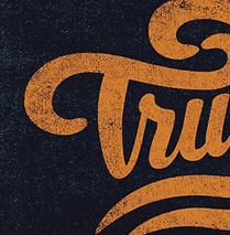

Responses by Tobias Rechsteiner, type designer, Grilli Type.
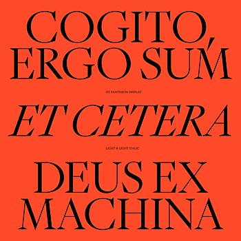
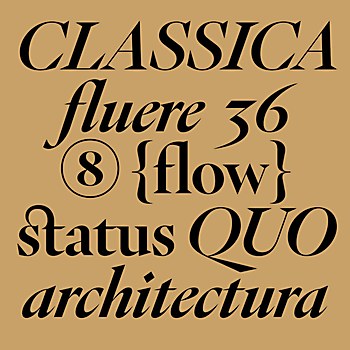
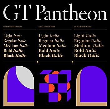
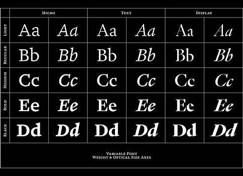
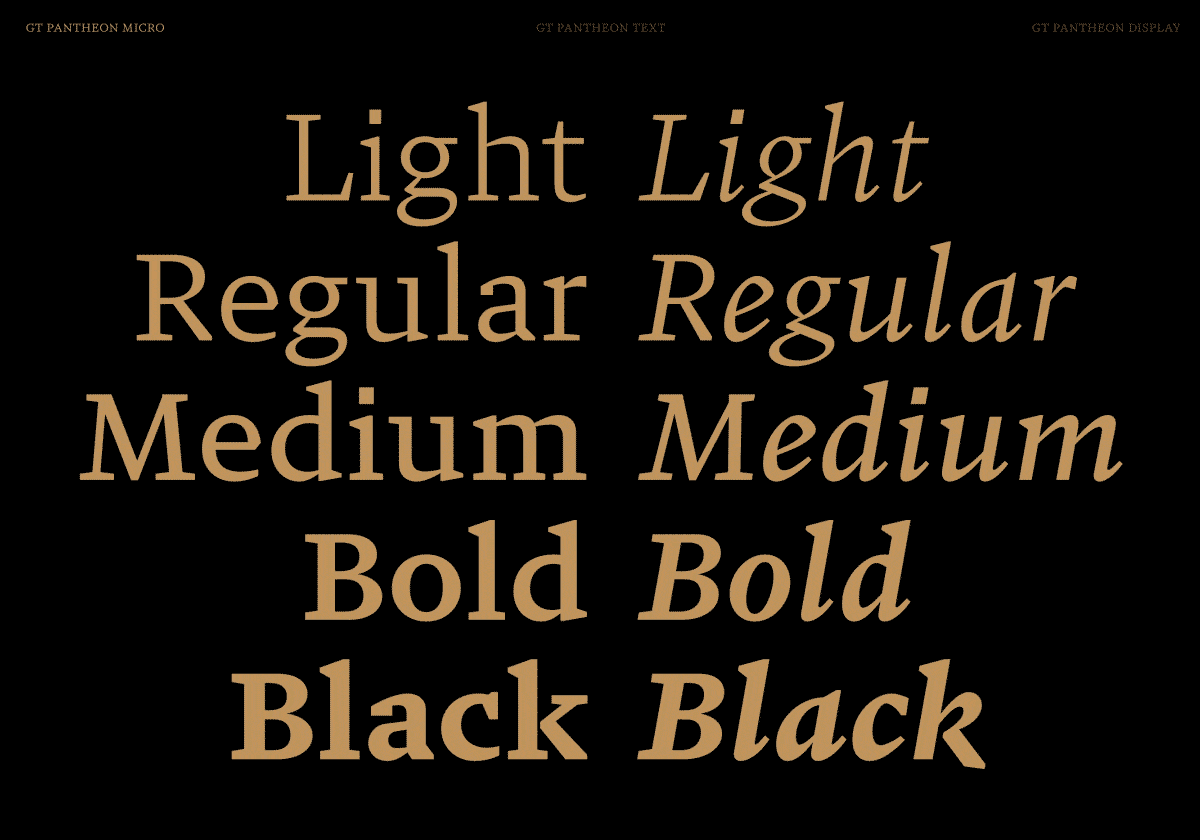
Background: GT Pantheon is a contemporary interpretation of historic shapes, exhibiting an expressive and dynamic character in every stroke. At its core are three optically adjusted faces—Display, Text, and Micro—each designed to represent the same type optimally at different sizes. As a variable font with a wide range of optical sizes, GT Pantheon offers versatility for both print and web projects, from ornate headlines to high-performance body copy in small sizes.
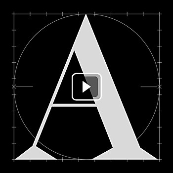
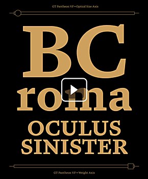
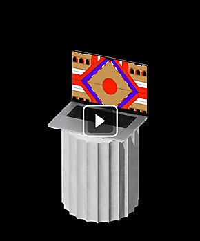
Design thinking: Inspired by a visit to the Pantheon in Rome, I began working on a typeface that would draw from architectural structures and letterform inscriptions. Noël Leu joined me to develop a larger system that let us explore the alliance of historic shapes with a contemporary feel.
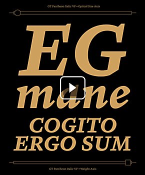
Challenges: Creating optical sizes. We had to meticulously balance design decisions to maintain consistency across a wide range of font sizes while allowing the design to adapt to size-specific limitations. This delicate equilibrium was crucial in achieving GT Pantheon’s versatility from headlines to small body copy.
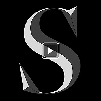
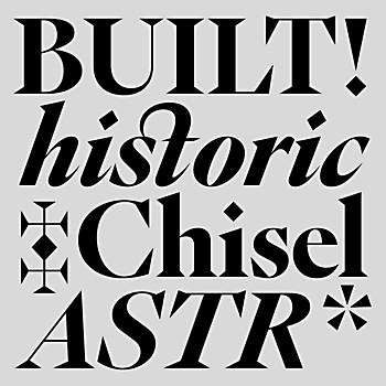
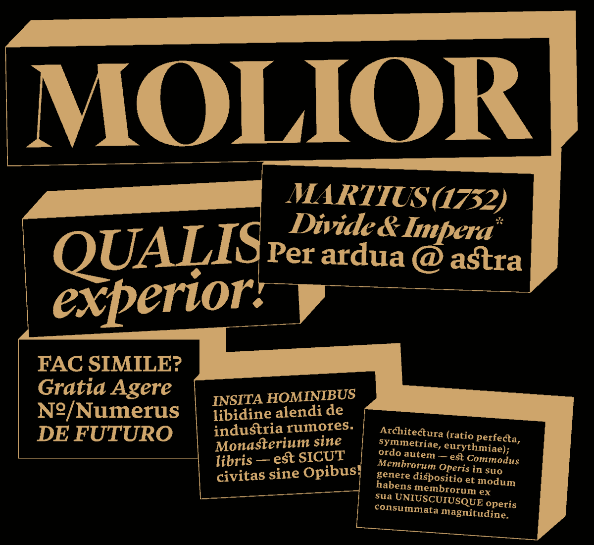
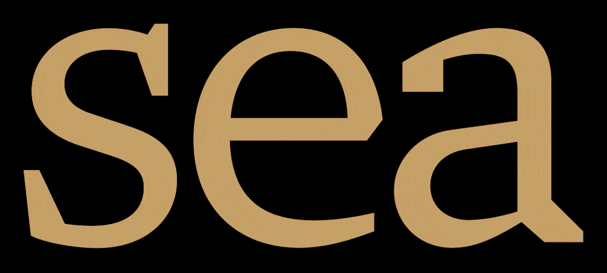
Favorite details: We’re particularly proud of GT Pantheon’s contemporary interpretation of calligraphic strokes. The modulated, nuanced execution of broad-nib pen strokes captures rapid directional changes, exemplified in the lowercase g and the question mark. These details embody the expressive and dynamic character we sought to infuse into every stroke, marrying historical inspiration with modern sensibilities.
New lessons: Developing GT Pantheon deepened our understanding of optical sizing’s historical mechanics. This technique, common in lead type but neglected in early digital fonts, has regained relevance with variable fonts. We learned that small-size letterforms benefit from reduced height variation between uppercase and lowercase letters, maintaining presence through an enlarged x-height and expanded counterforms. This exploration was crucial in achieving GT Pantheon’s versatility across different sizes in both print and web applications.
Visual influences: GT Pantheon’s digital design is heavily informed by numerous hand drawings and sketches, influencing shape transitions between archetypes. As size increases, the typeface reveals its expressive nature, illustrated in the capital B: from Micro to Display, the upper belly’s stroke sinks into the lower bow in an almost Jugendstil-like manner. Early “brutalist” explorations remain visible in letters with diagonal strokes, such as the affected J and j and serif-less legs of K and R. The i dot subtly shapeshifts, becoming a floating diamond shape in Text and Display, rectangular in Micro, and a trapezoid in italics. These elements contribute to Pantheon’s effusive character while maintaining its contemporary feel.
Browse Projects