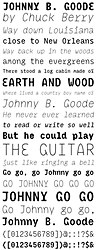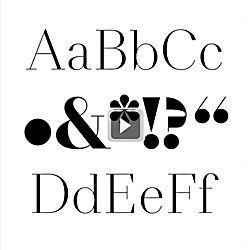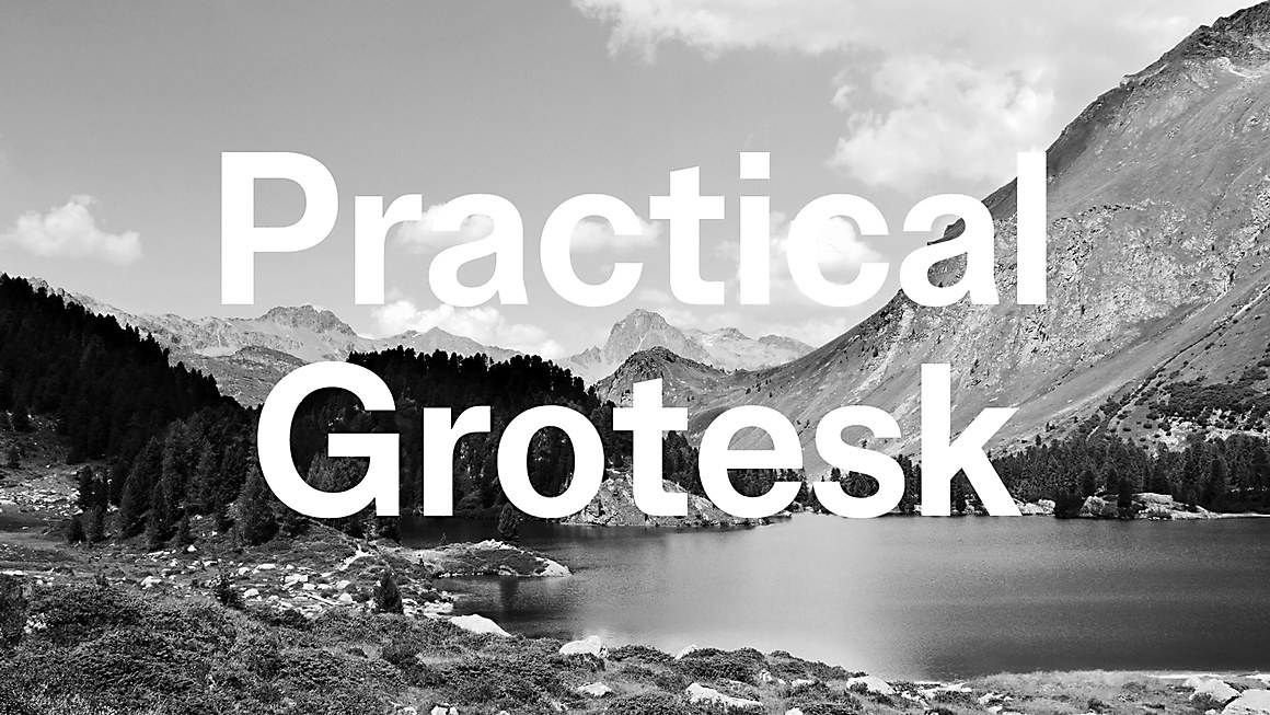

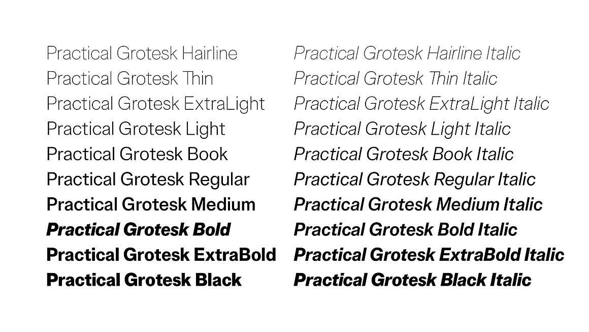
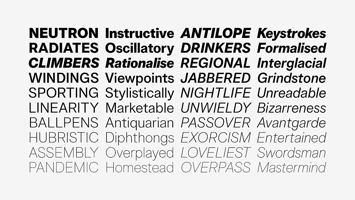
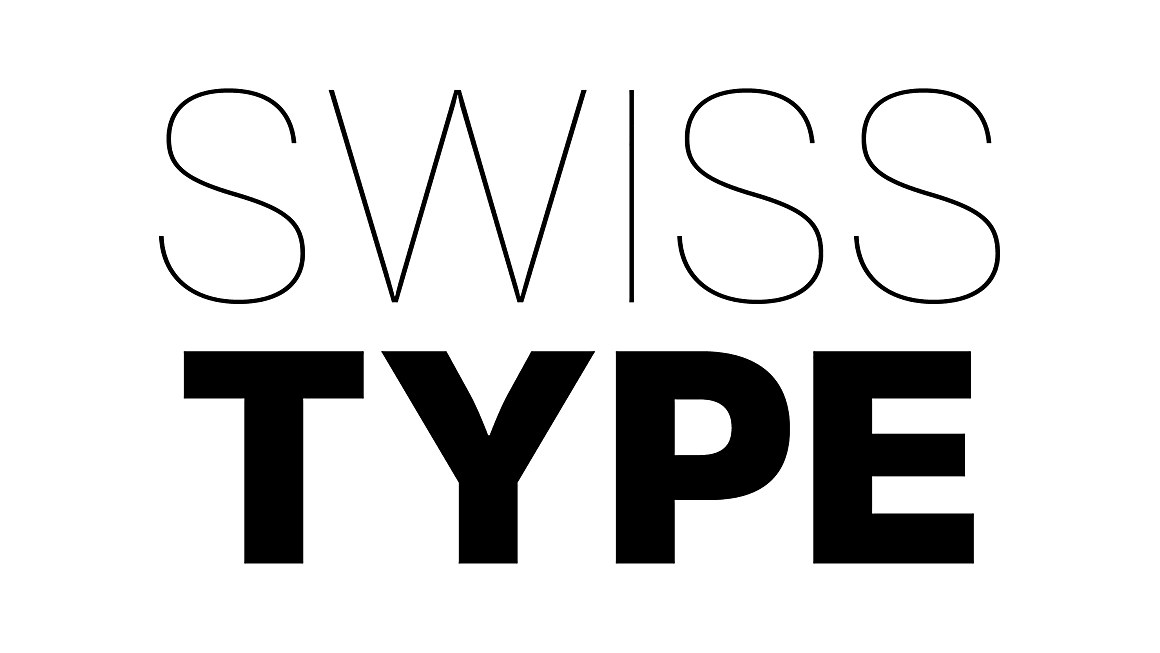

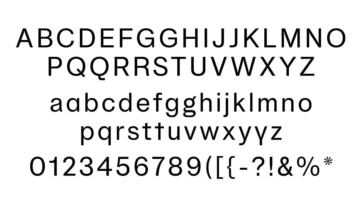
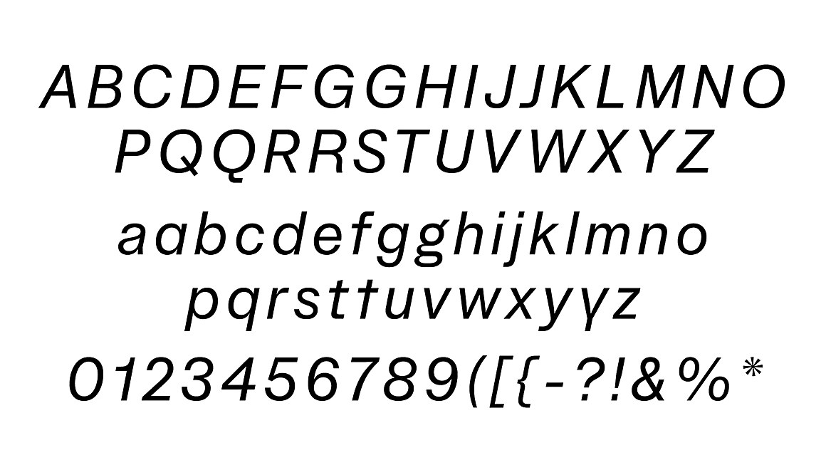
“Investigating the rational simplicity of mid-twentieth century modernism, Practical Grotesk is my take on the neo-grotesque genre. Drawing influence from the superstars of the last century—like Akzidenz Grotesk, Folio, Neue Haas Grotesk—as well as later, more ‘confidential’ responses like Forma and Unica, Practical Grotesk is an exercise in style, a love letter and a tribute to the legacy of Swiss typography. First developed as a single regular style to embody and carry the identity of Apex, Practical Grotesk slowly grew into a comprehensive family of ten weights from hairline to black, and their italic counterparts to provide graphic designers with a solid, versatile sans-serif workhorse.”