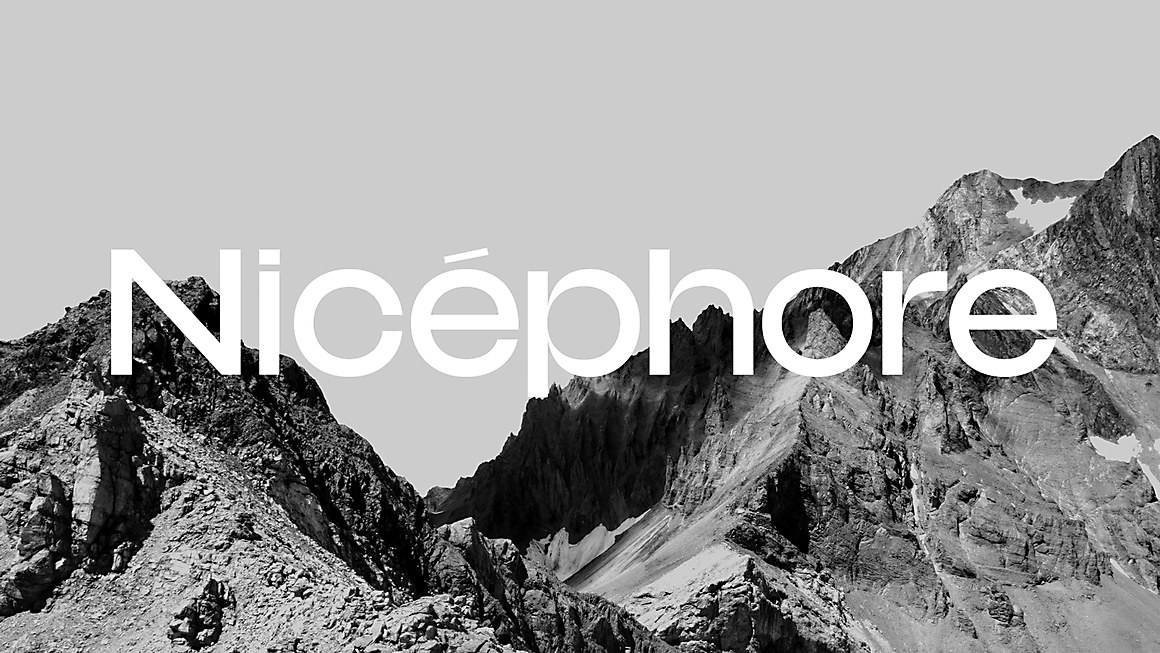

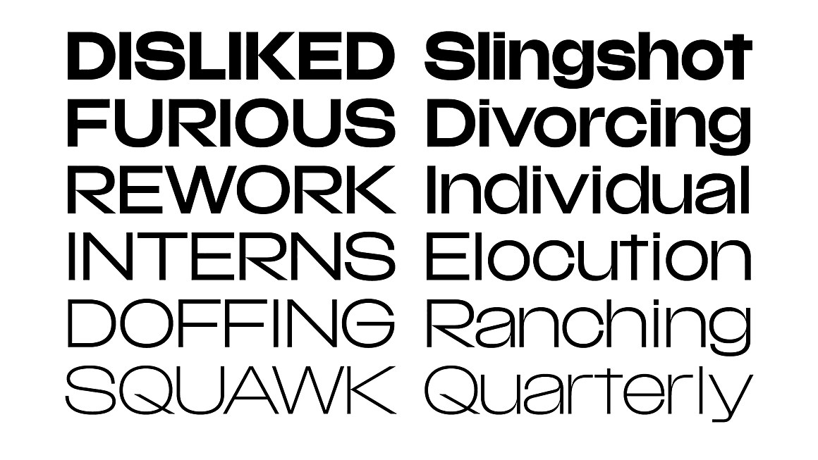
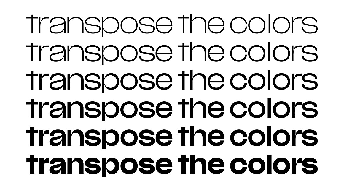
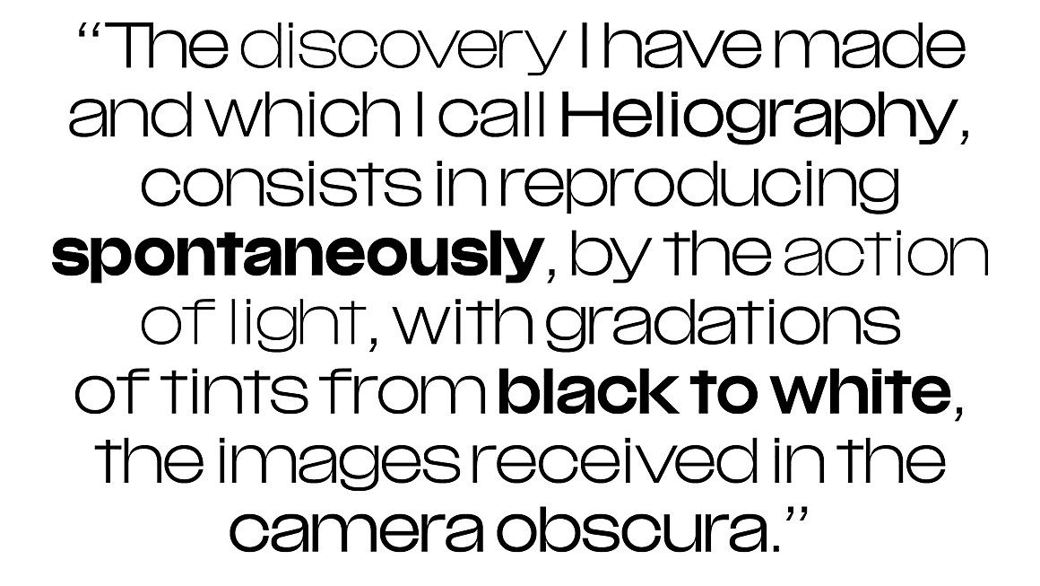

“Drawing influence and mood from phototypesetting-era sans serif fonts—notably Brasilia by Albert Hollenstein and Albert Boton—Nicéphore is a disguised quiet guy. Look again and you’ll probably notice its highly contrasted joints, its solid feeling and surprising letter shapes. The Nicéphore family is a variable font exploration of the ‘multiplexing’ principle: each six styles are drawn on the same width, allowing you to change weight on the fly without disrupting the layout. A perfect choice for nice rollover effects on the web, type animations—you name it!”